UNCF TechHub and Ernest E. Just Life Science Society
Two professional networks for the United Negro College Fund, one for the life sciences and one for technology careers, built on one design system. I led the design of both: 967 screens, from onboarding to hiring, summits, grants and the emails that hold it together.
- Client
- UNCF (United Negro College Fund)
- Role
- Design Lead, via Brickroad (US agency)
- Years
- 2021 to 2024
- Outcome
- Merged into HBCUv, UNCF's digital learning platform
Ernest Everett Just was a pioneering Black biologist working at the start of the twentieth century. UNCF, the largest private scholarship provider to minority students in the United States, put his name on a network where Black scientists, from an undergraduate to a tenured professor, could find each other, their research and their next position. TechHub carried the same idea into technology careers.
General networks already existed. These had to encode how academic and technical careers actually work: papers as credentials, grants as career fuel, employers as part of the community, and an annual summit as the room where the community becomes real. The decisions below are that encoding.
The career ladder is the data model
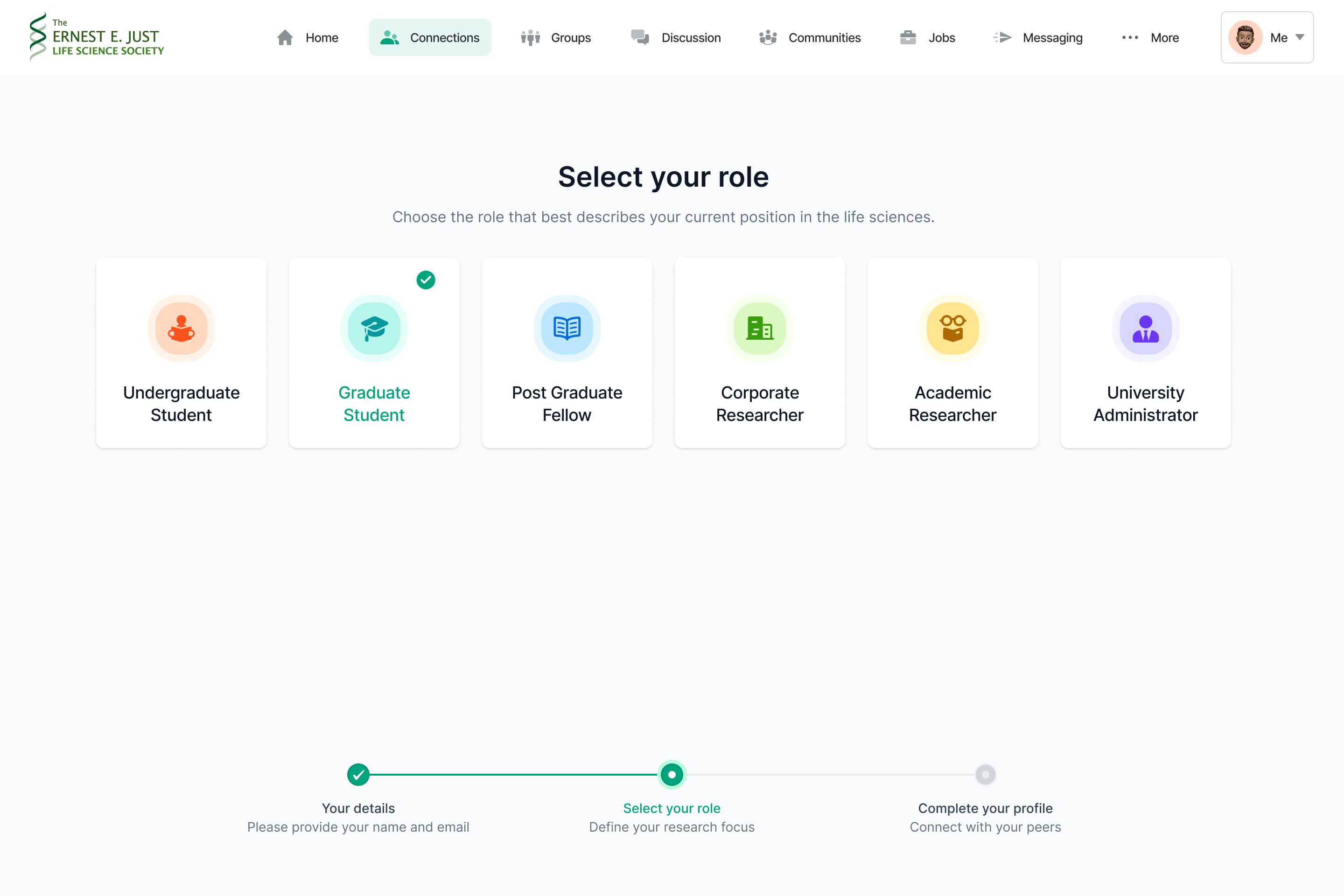
Registration asks one structural question: where are you on the ladder. Undergraduate, graduate, postgraduate fellow, corporate researcher, academic researcher, plus a role for university administrators. Each role gets its own profile template, and the fields grow with seniority. An undergraduate profile asks for a school and research interests. A graduate profile adds the principal investigator, because in science that relationship is the credential. A faculty profile carries publications, presentations and a full CV. A network that shows a first-year student the same form as a professor has misunderstood both.
Two products, one structure
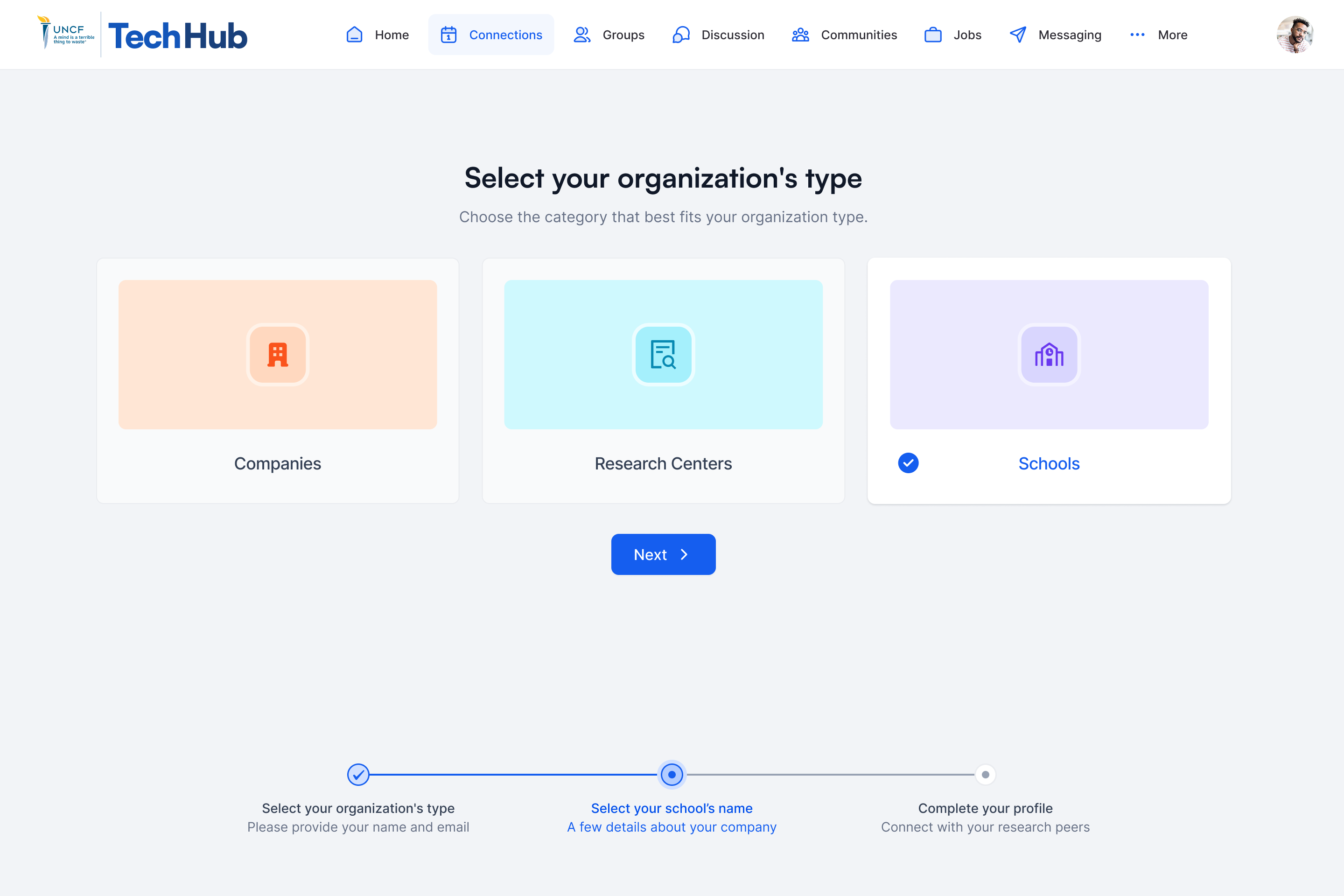
Set this screen beside the one above. One is TechHub onboarding an organization, the other is Ernest E. Just onboarding a person. The navigation, the cards, the three-step progress and the spacing are the same. The brand color and the vocabulary change. The component library was kept as two copies, one per product, each adjusted to its own brand on the same structure. That is how 967 screens stayed consistent across two products with different audiences. It is the system that started on Possip and was rebuilt for Productions.com, developed further here.
Papers and funding are infrastructure, not decoration
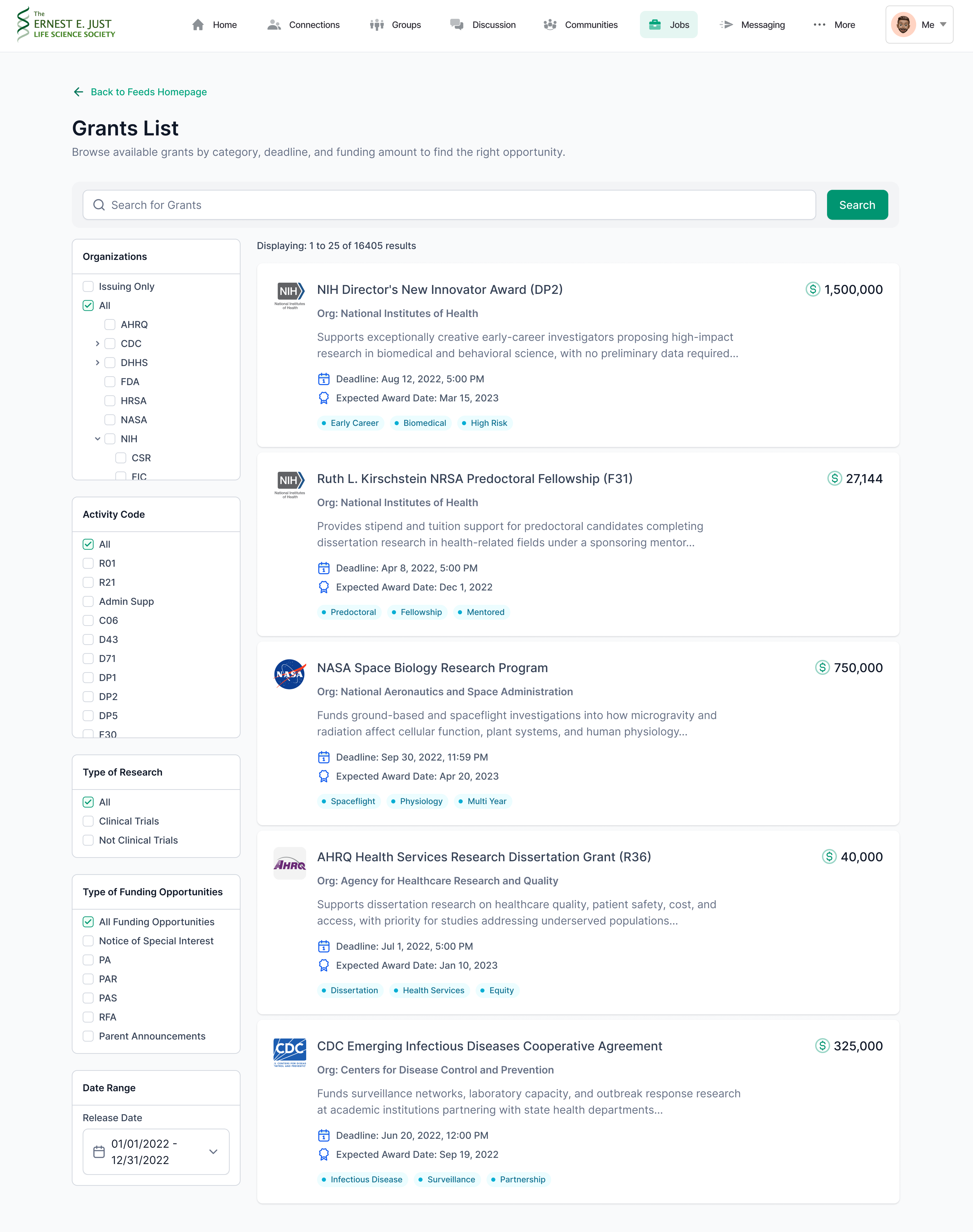
A social network shows you people. This one also shows you the two currencies of a scientific career and wires both to your identity. Researchers search PubMed, the federal index of biomedical literature, inside the platform and claim their own papers onto their profiles. Grants get a full directory, filtered the way funding is actually organized: by issuing agency and institute, activity code, type of research and type of opportunity, with a tracking dashboard and reminder emails before deadlines. The filters use the federal vocabulary as it is, because that is the vocabulary researchers already search in.
An announcement is only useful to the right people
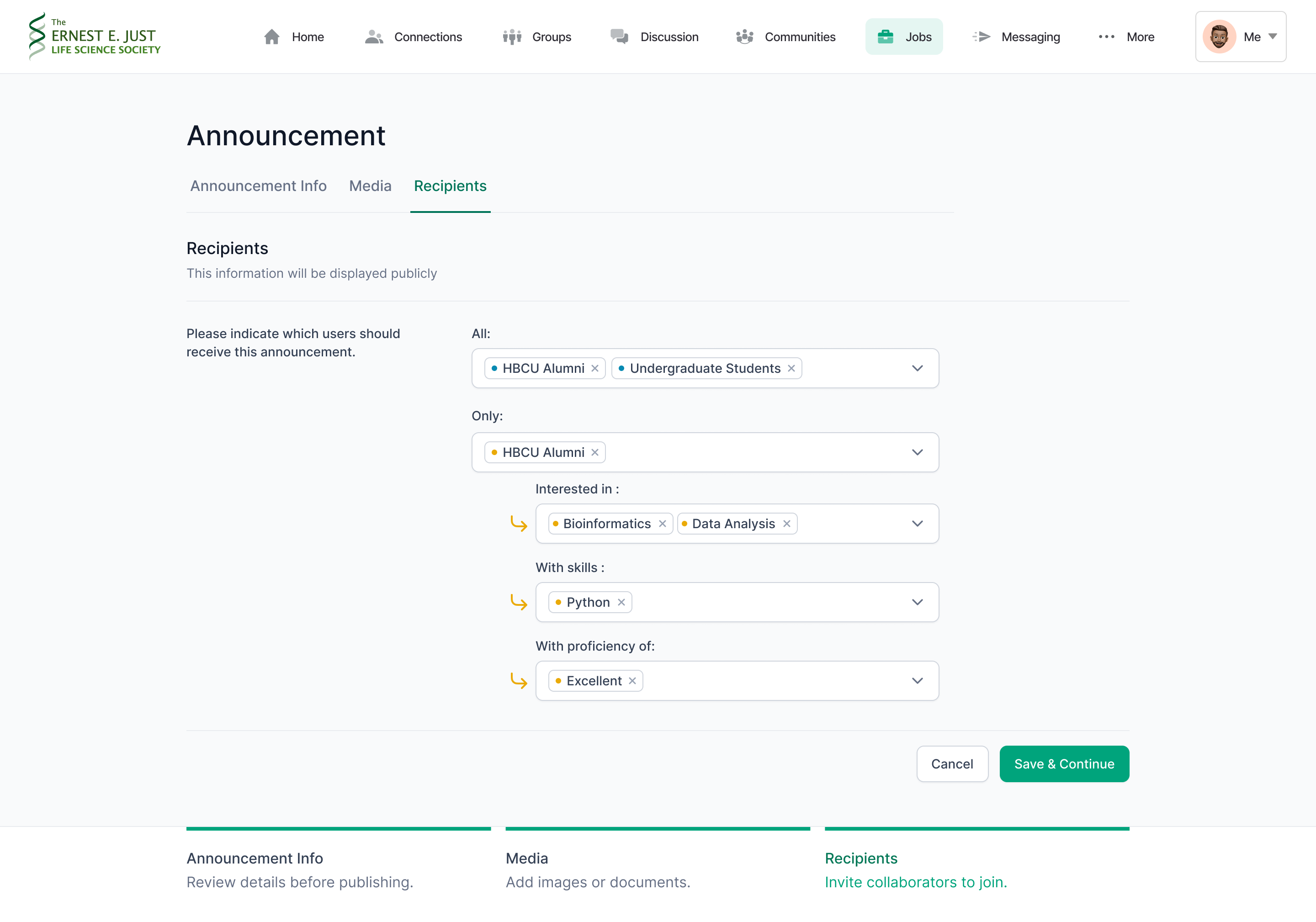
Sending to everyone is easy and mostly noise. The recipients step builds the audience as a sentence: send to all of these groups, or only to this one, then narrow by interest, by skill and by proficiency. Each narrowing step hangs off the one before it, so the audience can be read back like a sentence before anything is sent.
Hiring happens inside the network
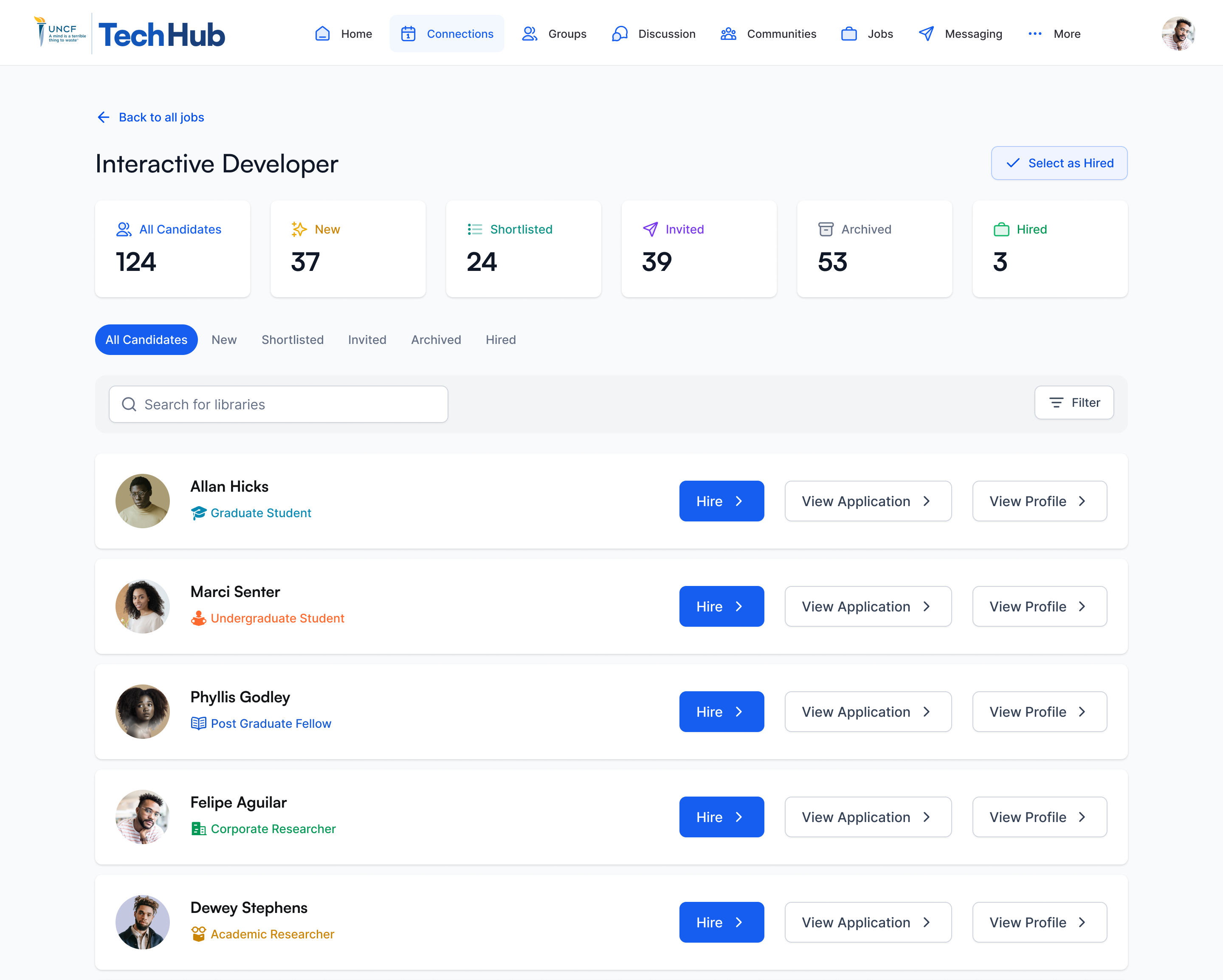
Employers are members, not advertisers. A company joins with its own onboarding and gets a full profile, and its jobs live inside the same network as the students it wants to reach. Each position is worked as a pipeline: new, shortlisted, invited, archived, hired, with a count on every stage. Every candidate carries their place on the career ladder from registration, so a hiring manager sees a graduate student or a corporate researcher at a glance, without opening a profile.
The summit is the flagship, and the design treats it that way
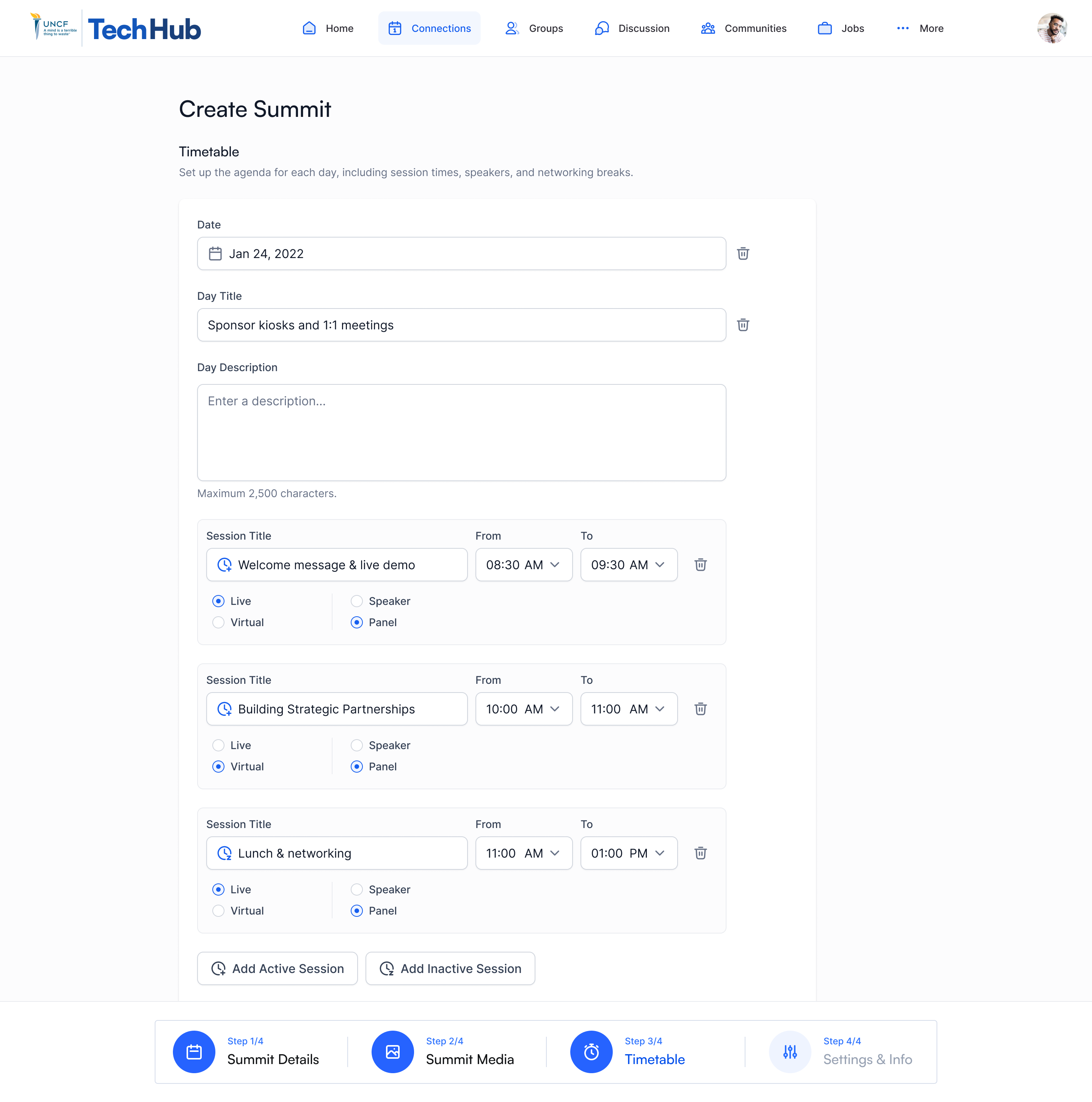
Fifty-two screens serve the summit system in the Ernest E. Just file alone, more than jobs or messaging. A summit is a selective, in-person event for students, so the design gives it the rigor of an admissions process and the logistics of an airline: applications with deadlines, team review with notes per applicant, acceptance and rejection emails, then emergency contacts, dietary needs, travel information and a schedule builder for multi-day agendas. The builder treats a day as data, not as a page: each session has its times, a live or virtual format and a speaker or panel type.
The inbox is part of the product
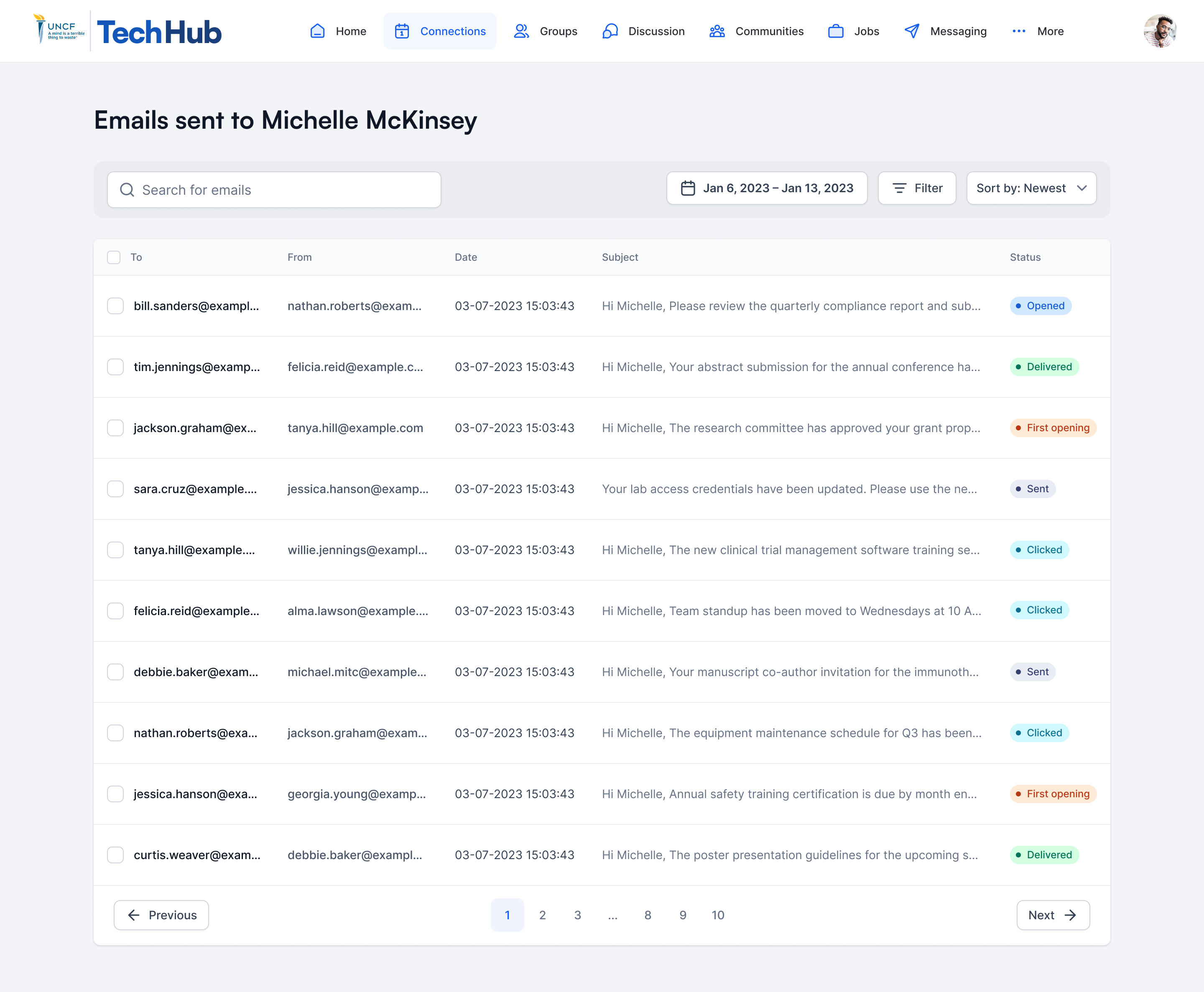
Busy academics live in their email, so email was designed as a surface, not an afterthought: thirty-eight transactional templates, from verification codes to daily agendas. Staff can also see what each member was sent and what happened to it: sent, delivered, opened, clicked. Whether someone received a message is answered on one screen.
The people who run the platform are users too
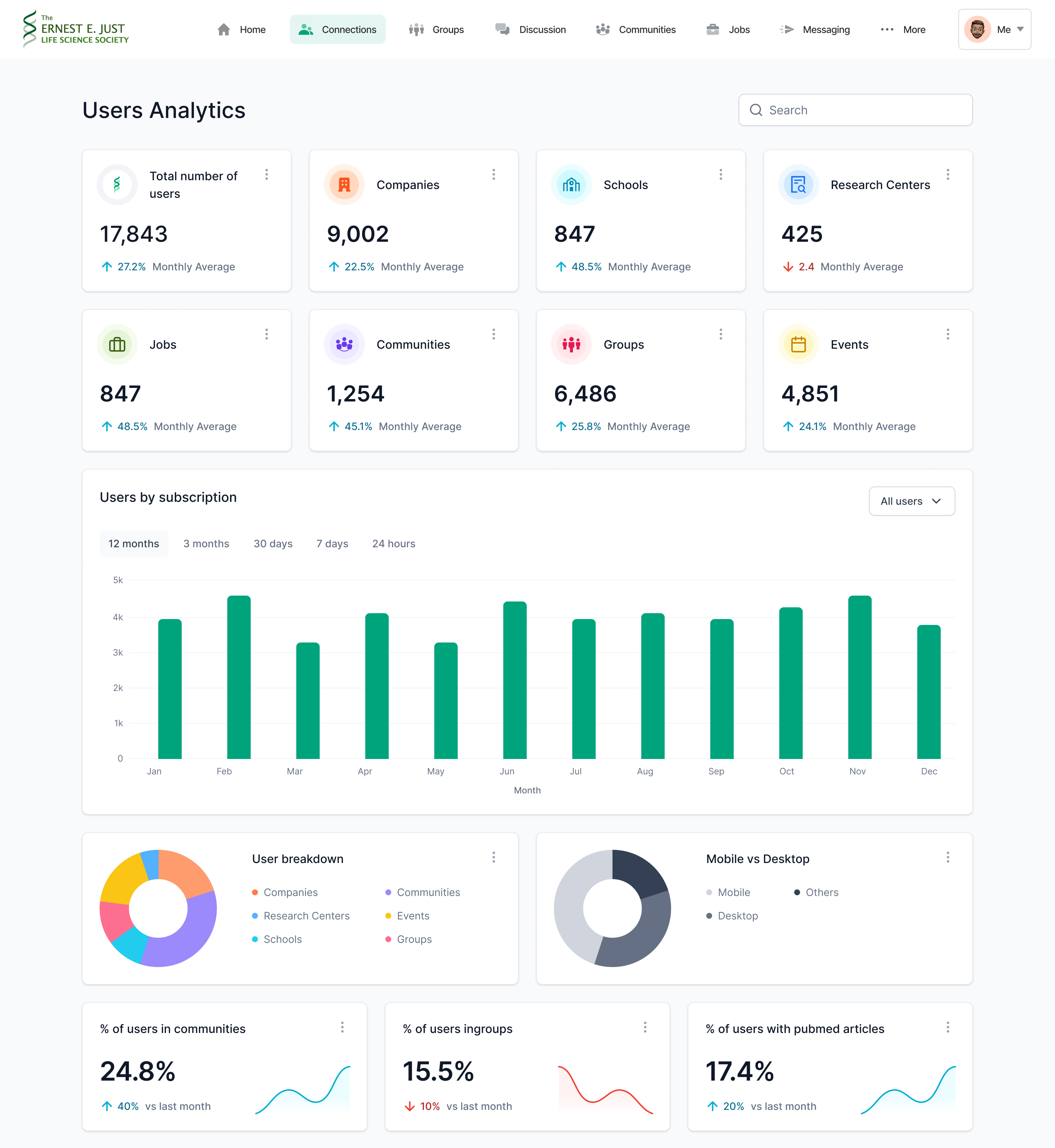
Version one of the analytics put every chart on one page. Version two splits it by the things an institution actually manages: users, companies, schools, research centers, jobs, communities, groups and events, each with its own view. It also measures the platform against its own purpose, including the share of members with published articles on their profiles.
What the redesign trail shows
The design file holds two visible eras, and the changes between them are legible decisions.
Navigation moved from a left sidebar to a top bar. The sidebar era had five modules and spent a seventh of the screen on them. By the second era there were seven and growing, and the sidebar had become a list problem. The top bar gave the full width back to content and let the vocabulary follow the strategy: Papers stepped back and Jobs stepped forward.
The summit page dropped its gate. The early version blocked registration until a profile was complete, which filtered out the people the summit exists to reach, students at the moment of highest intent. The redesign lets anyone answer first and asks for the profile afterwards. Intent first, paperwork second.
Company pages grew from a sidebar card into a full profile with publications, posts, team and jobs, and the connections a visitor already has there. The analytics split by audience, as shown above. Each change follows the same direction: give each kind of member, and each kind of operator, its own view of the same system.
How it was built
Designed in Figma at a 1440 pixel desktop width, with every email template drawn as its own 640 pixel frame. State coverage was part of the work rather than an afterthought: dedicated empty states for every kind of content, from users and companies to summits and schools, error pages with a way back, six states for the notification center and thirteen for a live webinar.
The component library existed in two copies, one for each product, each adjusted to its own brand while keeping the same structure. Engineering worked from Figma Dev Mode, and from a clickable prototype whenever a flow needed to be seen in motion before it was built. I led the design inside a product team of eight to ten people.
Outcome
The work later merged into HBCUv, UNCF's digital learning platform for historically Black colleges and universities. What the files leave behind is 967 screens of evidence that a mission-driven institution can be served with the same systems rigor as a venture-backed marketplace.